BIOBOT
Company
BioBot built an AI that helps medical professionals prescribe opioids after surgery through complex algorithms while comparing national prescribing patterns and patients’ needs.
The Challenge
In the midst of the pandemic, we were tasked with working alongside medical professionals to help Biobot find a design concept that would help increase signup conversion rates. In doing this, BioBot could structure a stronger algorithm to allow medical professionals to prescribe opioids more efficiently.
The Summary
The project began with research, synthesis and ideation in mind but we struggled with finding users to interview in the middle of a pandemic. Therefore, the team decided to start reaching out to users outside of the pool of contacts provided by the client, which was successful.
We also hit major issues during the second week of the ideation process after finding the value of the product in the market, which was slim.
But the team was able to come up with a very valuable design concept in the end that was well received and is now in the adoption phase.
Role
User Interview
Wrote interview script
Interviewed users via zoom
Style Guide
Created colors, typography, icons, logos
Product Design
Created design concepts and drawings for desktop and mobile interface using Figma
Modified and revised existing designs to meet users expectations
Identified opportunities for new products
Prototyping
Employed design concepts into functional prototypes using Figma for over 40 frames
Tools
Figma
Miro
Google Suite
Invision
Adobe Suite
Phase I
Opioid Crisis Research
Before user research, our team wanted to have an understanding of the opioid crisis in the U.S. and learn how opioids are currently being prescribed by medical professionals. We looked at major medical websites for information such as CDC and Drugabuse.gov.
“Over 750,000 people died from a drug overdose between 1998 and 2018” - CDC
Two out of three of those deaths were from an opioid.
“Opioid crisis has cost the American economy over $2 trillion dollars.” - CNN

User Research/Usability Test
We conducted a one week sprint with 5 medical professionals over Zoom who were prescribing opioids.
20 minutes Usability test of current website
30 minutes interview

4 Surgeons

1 Pharmacist
Key Findings

Opioid Crisis
Lack of data sharing makes it hard for medical professionals to compare prescription patterns. They need a common platform for data sharing.

Limited Time
Time is valuable for medical professionals. They need a quick way to fill out patients’ forms.

Pain is Subjective
Prescribing opioids requires an individual assessment because every patient has a different pain tolerance. They need a way to track prescriptions to avoid over use.
Phase II
Issues with BioBot’s Product
Heuristic Analysis
To understand more on why the users were having issues navigating through the website. Our team ran a heuristic analysis. This helped us point out two main areas we could make an impact.
Make the website credible so we can build user’s trust
Add value to the product by making its functionality understandable in simpler terms
Competitive Analysis
So far from all the information we had gathers, we had a basic idea of separating the information on the patient information input form into more digestible format, but we needed to conduct more research on competitors to understand how they solve the same issue.
Through our research, we had found that 100% of the users interviewed used Epic, so by even viewing a few screens from the platform, we were able to get a sense for how this information is typically displayed.

Key Findings
All platforms had Tab system for easy access to patient’s information
Patient’s name was always displayed clearly on top of every page
Portals were all aligned on the left of platform
Phase III
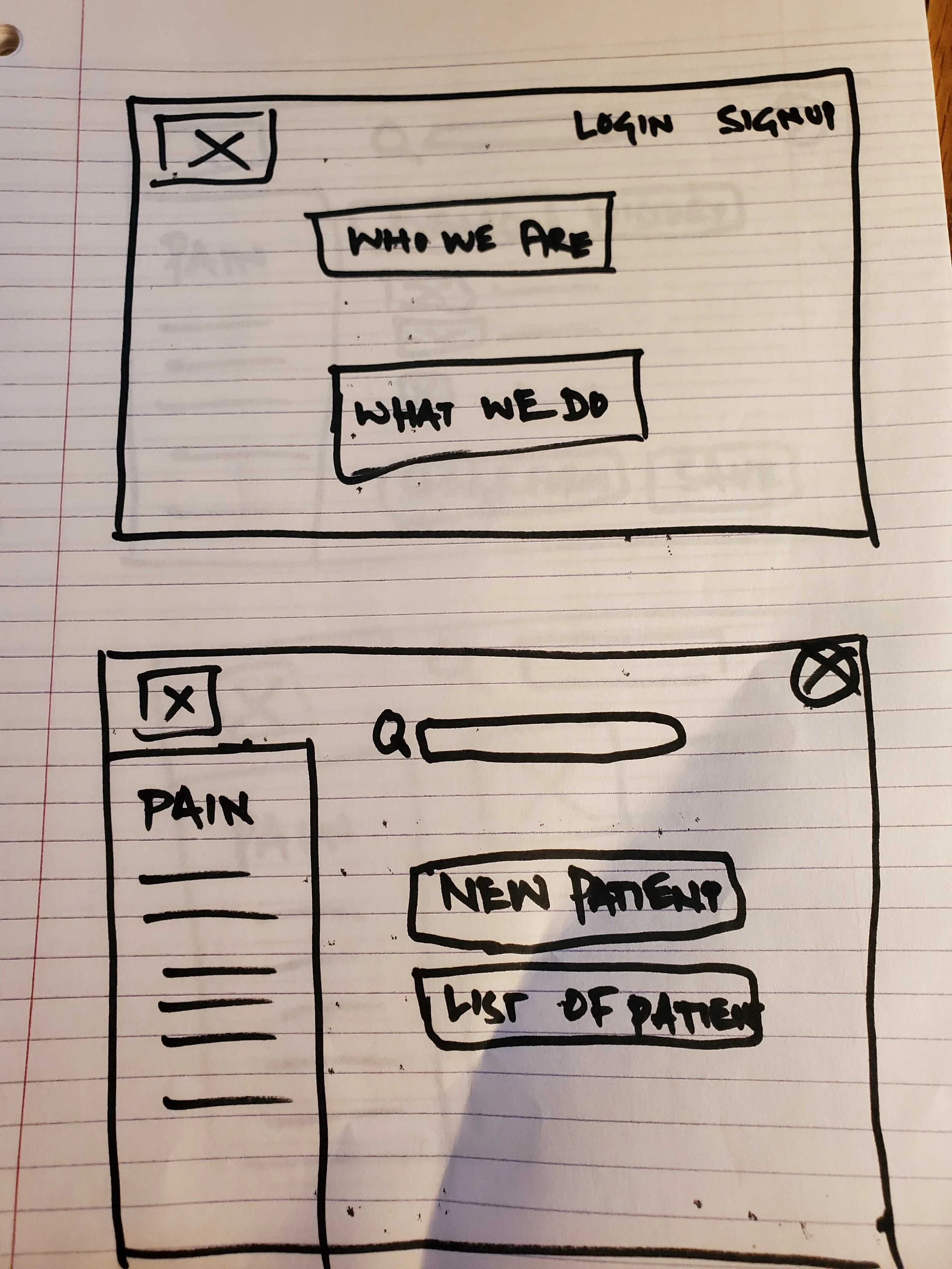
Design Studio
We ran our design studio with inspiration from the competitor and findings from usability testing of the BioBot website. Our main focus was to make the portal easy to navigate and to redesign the home page to give users a clear view of the product’s functionality.
Key Focus
Credibility
→ Users asked: Am I going to have to worry that this program might not give correct dosages for my patients?
Efficiency
→ Users asked: Is this going to take too much time out of my already busy schedule?
Value
→ Users asked: Is this program going to add any sort of value that I could not do on my own now?


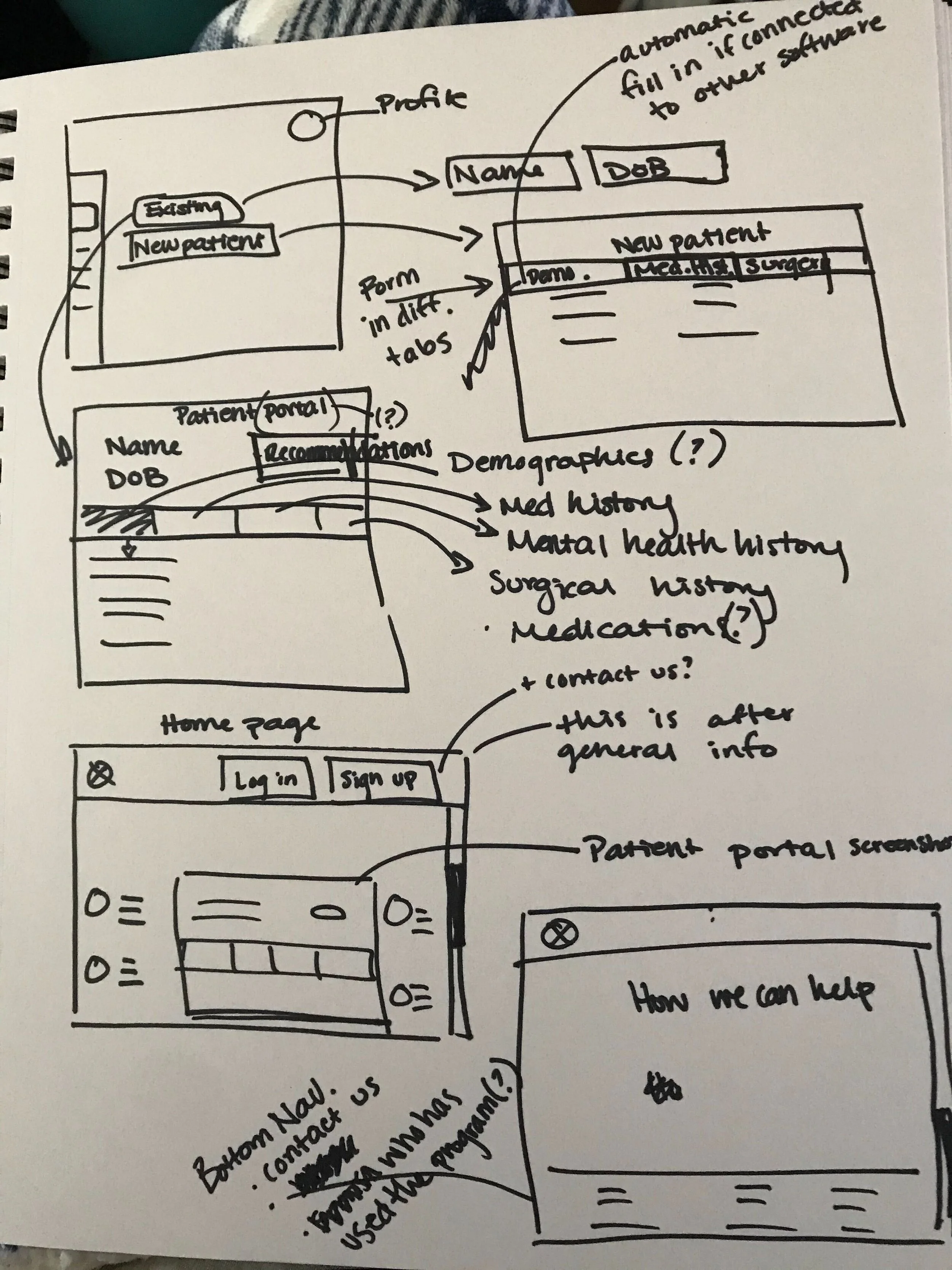

Style Guide
We chose colors that would be appealing for users across a wide base, as scalability between institutions was a stakeholder goal. Our color palette represents credibility, trust, knowledge, power, professionalism, cleanliness, calm, and focus, and it is most often used in the medical field.

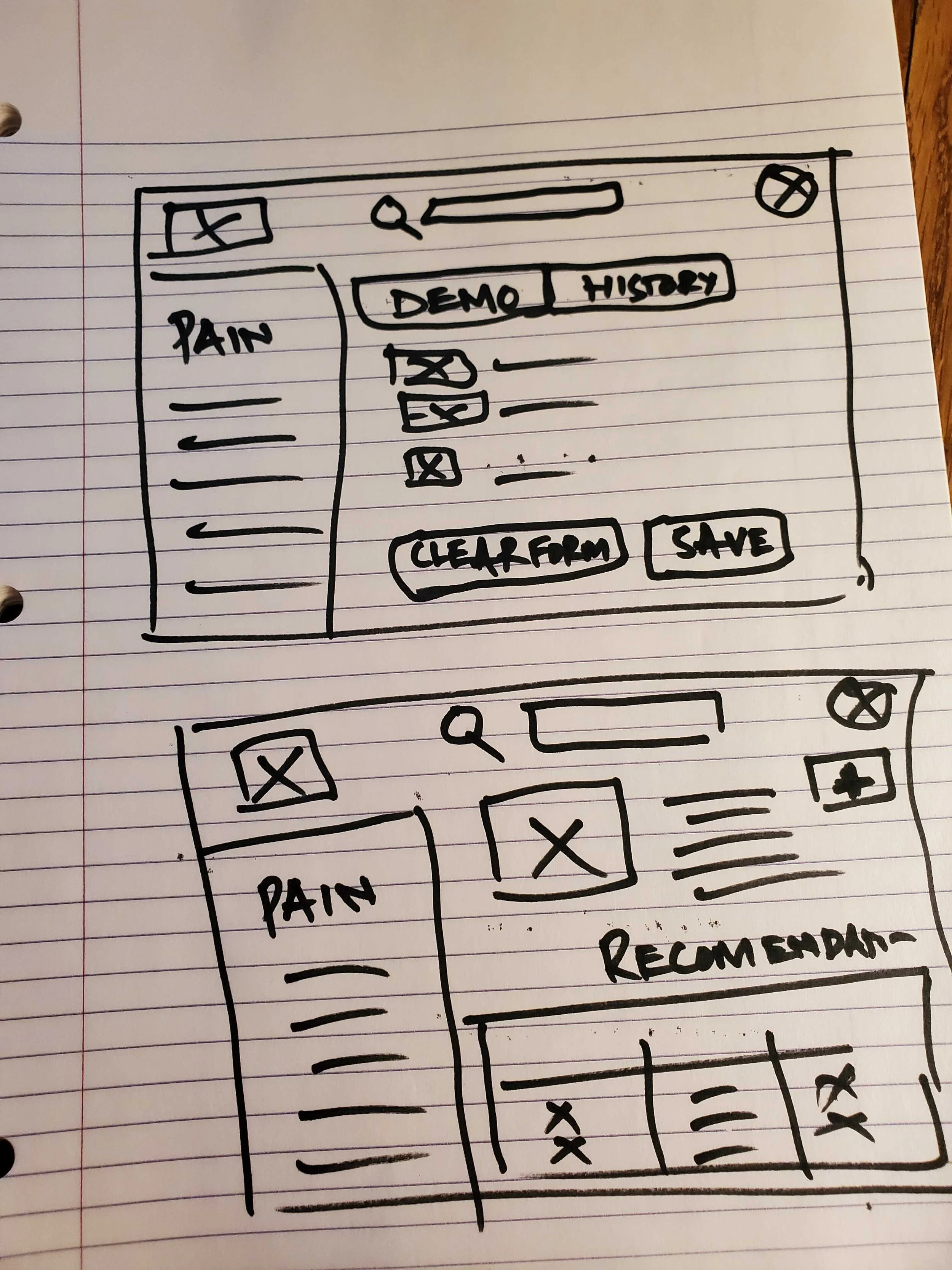
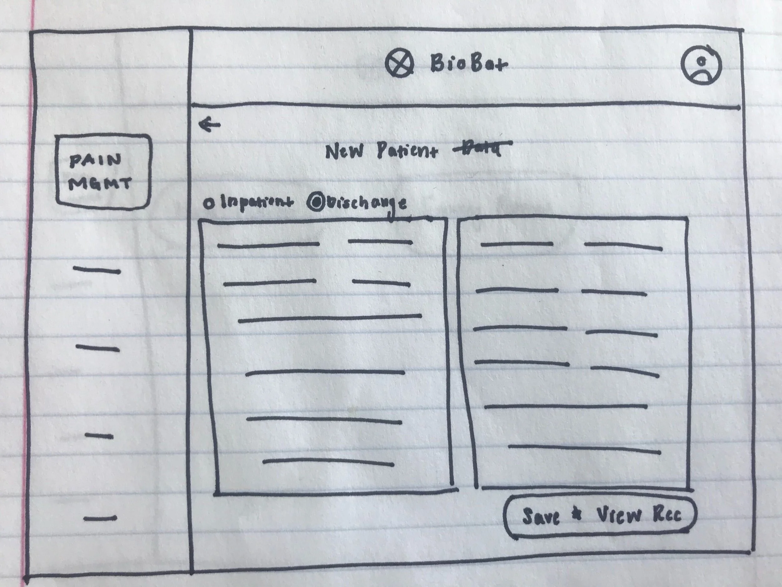
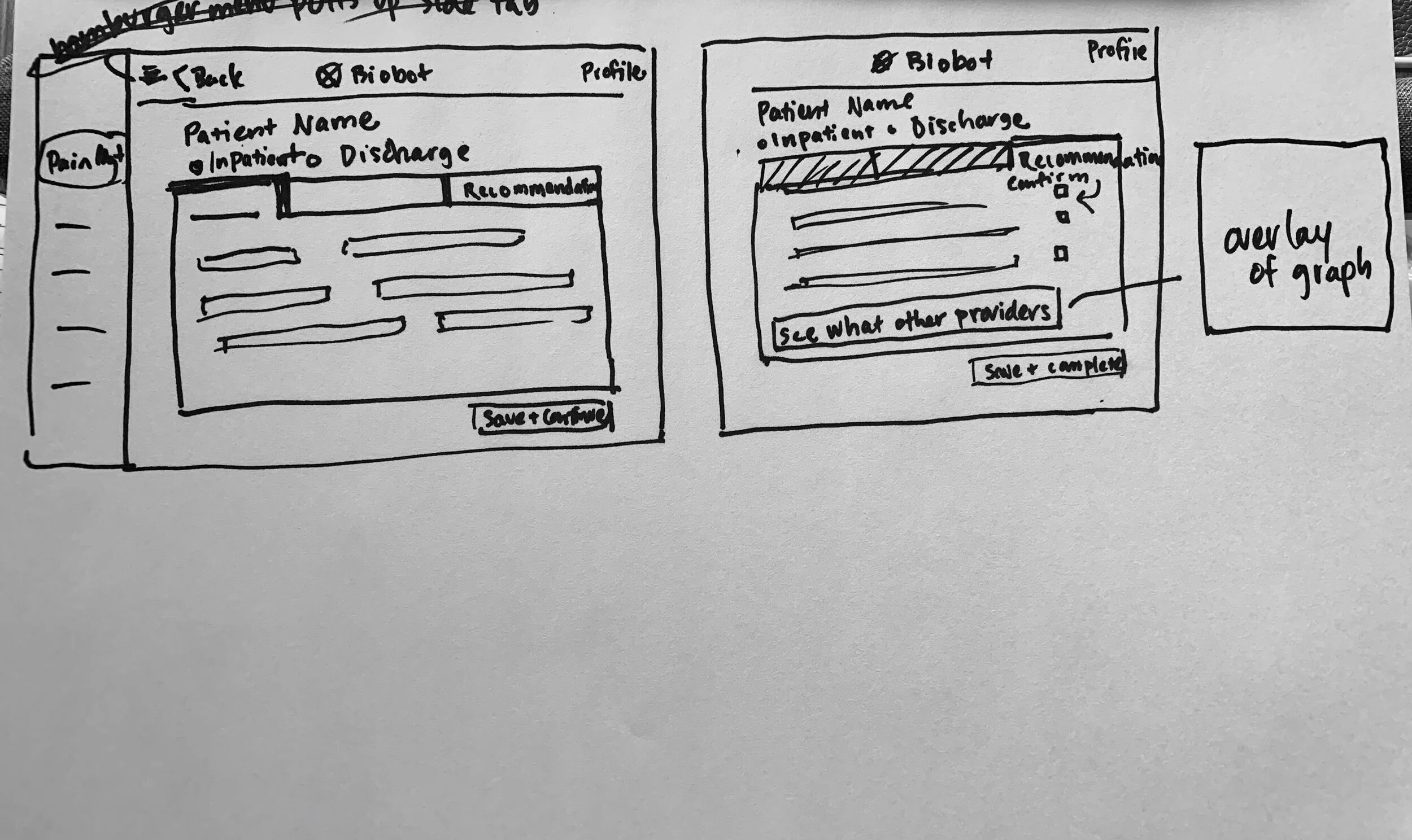
Final Design and Prototype
Patient’s Demographic Fill-out Tab
Patient’s Recommendation Fill-out Tab
Graph Overlay with Opioid Prescribing Pattern of Inhouse and Countrywide Institutions
High Fidelity
Video Walk Thru

Usability Testing
We were able to run usability tests with 4 surgeons over Zoom. They were assigned 3 tasks including opening an account, inputting patient’s medical information, and opening an overlay that provided opioid prescription patterns among different institutes. We also asked them to describe everything they were seeing.
4/4 users were able to complete the tasks
Our testing proved our biases about the age group this product should be targeted to:
Seasoned Medical professionals would not use this or nor saw value in this product.
Medical professionals who were early in their career expressed how vital this web portal could be.
The Results
While the redesign of BioBot’s website is still being implemented, we were able to help BioBot find their target users.
90% of the users claimed they would use this product and saw immense value in it.
We refocused BioBot’s target users to the age group that actually saw the product’s potential.
The Wrap Up
Our team gave a final presentation to BioBot 17 days from when the project began. We were able to discover value in a product that was not well received during the first round of research, and our team was able to recommend a user base that actually found value in this product and who were excited by it.
“If you could get to the point with significant granularity… where I know this is exactly what patients are getting, it would be very helpful for me” - Surgeon, NYU
Next steps
Run more usability tests on new design interface
Card sorting exercise on patient’s fill out forms
Design mobile responsive app